How to avoid layout shifts caused by web fonts
One of the outcomes of the release of Core Web Vitals (and subsequent inclusion in Google's page ranking algorithm) is that we have been paying more attention to unexpected layout shifts and the cumulative layout shift (CLS) score.
Some sources of layout shifts have been simple to resolve: pre-allocate the correct space for dynamic elements, use width and height attributes on images and prioritise visible elements in your HTML document. One common cause of layout shift is surprisingly difficult to resolve though: flashes of unstyled text (FOUT).
In this post we will explore the surprisingly complex world of text rendering on the web and some techniques to remove FOUT while not incurring a CLS penalty.
In summary we need to prevent the layout shift by letting the browser render in a fallback system font if it doesn't get the web font in time, then optimise our fonts to try to get them to the browser before it needs them:
- use
font-display: optionalto prevent layout shifts - subset fonts and serve as
woff2 - use variable fonts or a limited set of weight variations
- preload critical fonts
- host your own fonts on your main domain
Why fonts cause layout shifts
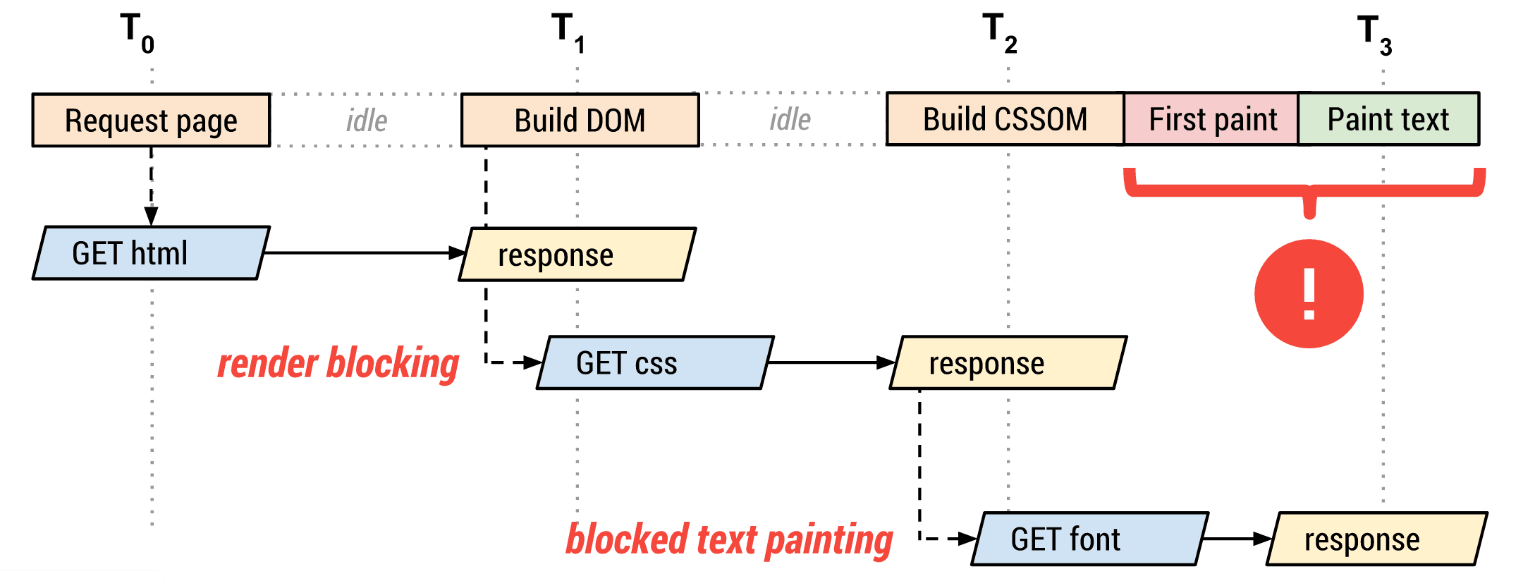
Unexpected layout shifts (page content moving around without user interaction) are bad for user experience. Fonts cause layout shifts when the size of the containing element (e.g. a <div> or paragraph) changes when the web font is downloaded. This occurs when the height of the font or the length of the paragraph is different with the web font compared to the system font. When laying out a page, browsers will use the dimensions and properties of the fallback font to determine the size of the containing elements, even if you have declared a web font to block the system font with font-display: block!
Lorem ipsum dolor sit amet, consectetur adipiscing elit. Proin aliquam metus eu lacus placerat feugiat. Suspendisse quis elit fringilla, luctus felis ut, ultricies leo. Morbi vel dui non risus aliquam rhoncus in ac justo. Mauris cursus diam id ipsum aliquet tempus. Praesent feugiat consequat risus, ut eleifend neque consequat quis. Maecenas rhoncus faucibus dui quis pretium. Nam ultrices rhoncus dui, at pretium erat rhoncus et. Vestibulum tempus diam vel ex venenatis placerat. Nam sed elementum odio. Suspendisse vel orci turpis. Fusce in maximus ante, non malesuada justo. Duis in tellus erat.
Detecting layout shifts
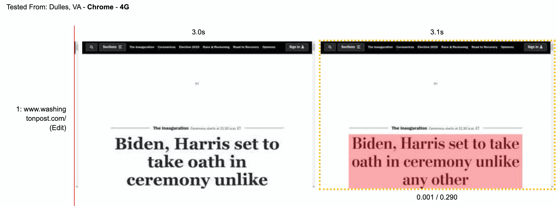
There are a number of methods to detect layout shifts due to web fonts, the most simple is to run your page through WebPageTest and use the filmstrip view. There is a toggle to show layout shifts, combine that with 'huge' screenshot images and a 0.1s interval to get a clear view of what is happening as your page renders (you can simply add this to the end of the URL: &highlightCLS=1&thumbSize=600&ival=100&end=visual&text=000&bg=fff"). The Washington Post has a couple of layout shifts due to web fonts, in the example below the headline text is one line shorter with the web font than without which results in a layout shift. Layout shifts are dependent on viewport size so make sure you test a few different devices.
You can also find layout shifts in the Chrome Developer Tools Performance tab, look for layout shifts attributed to text elements.

I've covered general layout shifts in more detail in a post on How to Improve Core Web Vitals.
Prevent layout shifts with font-display
The dirty little secret of this blog post is that you can resolve layout shifts due to fonts with a single line of CSS:
font-display: optional
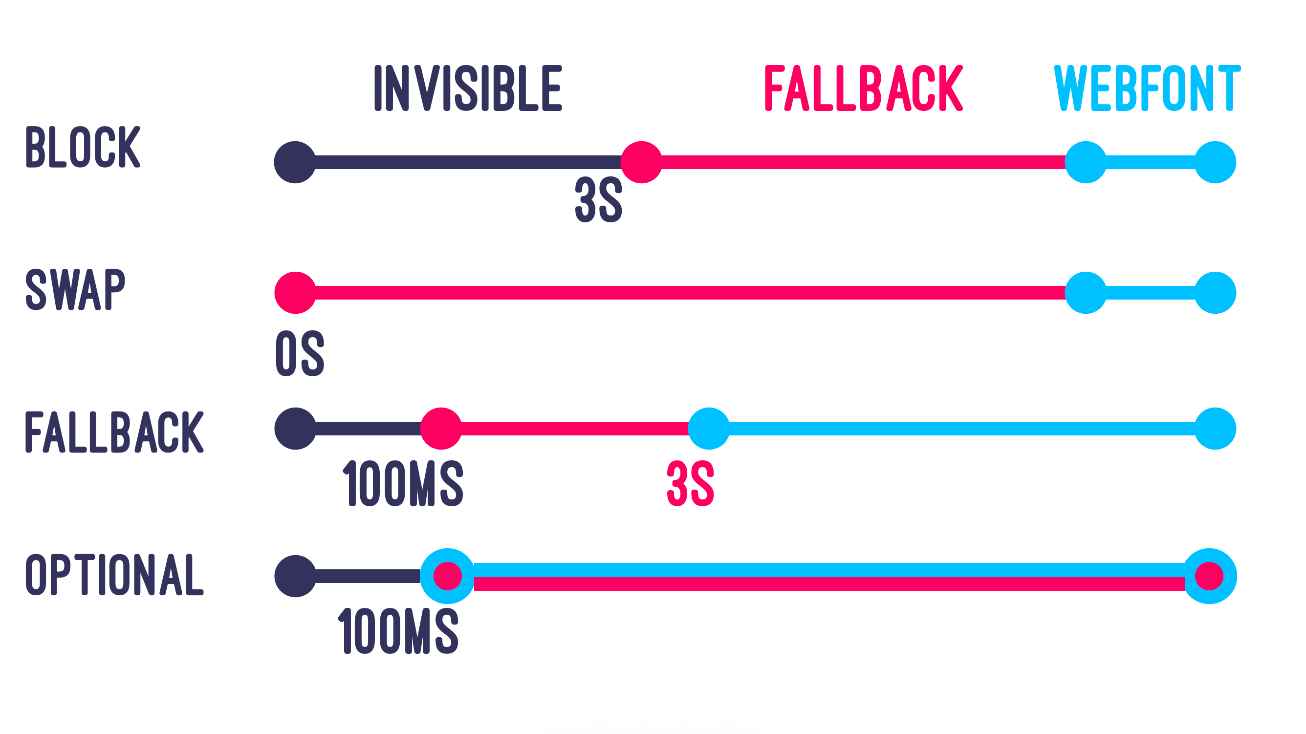
This directive lives in your font-face declaration and tells the browser to use a fallback system font if the web font is not available at the time of rendering text (plus 100ms). This means that on uncached page loads there is a chance that the fallback font will be used, but all subsequent page loads should be rendered with the web font, as it will be downloaded and available in cache. There are other options, shown in the image below:
- block - hide text for up to three seconds while waiting for the web font, and always swap in the web font when it loads
- swap - show text as soon as possible, and always swap in the web font when it loads
- fallback - hide text for up to 100ms, then only swap in the web font if it loads within three seconds
- optional - hide text for up to 100ms, then only use the web font if it is available - never swapping
If it's that simple, why this whole blog post? Unfortunately system fonts are not necessarily the nicest designs, and they are not consistent between operating systems. Most designers will cringe at the thought of showing users a fallback system font. The rest of this blog post details various optimisations to get the font files to the browser quicker, allowing the use of any font-display option but with minimal risk of showing a system font, or for options other than optional: without triggering a layout shift. We will also look at font-face descriptors / f-mods and progressive font enrichment for potential further optimisations in the future.
Load fewer font files
Downloading one or two font files to render text won't have a massive impact on speed, downloading five or ten font files will! Ensuring that you deliver the minimium viable number of font files is the best way to ensure that the browser has them available at layout, thus reducing the likelihood of FOUT layout shifts. Let's look at some tricks to load fewer font files while maintaining your design.
Use faux bold and italic
Designers hate this one weird trick!
Font stacks generally include a bunch of different files, from extra-light italic through to extra-bold. Combining nine font weights with normal and italic variants produces 18 separate font files! Fonts that are not used on the page will not be downloaded, but for the odd occasion where only a single word is both bold and italic (for example) the whole font file will be downloaded to render the single word.
Browsers can make bold and italic versions of fonts themselves, this is called faux bold and faux italic. This could mean that a single regular weight font file is all you need! This should be tested and approved by any designers involved, I recommend a blind Coke vs. Pepsi style test to prevent any bias impacting the outcome.
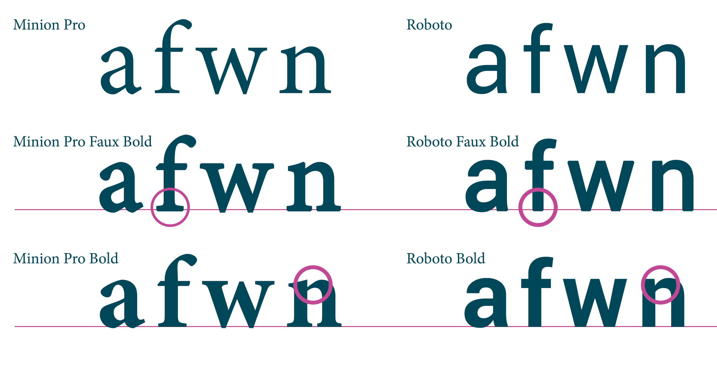
There may be subtle differences between the browser's version of a bold font and the font creator's version, as shown above. For some fonts the differences will be too great to consider, especially fancy ones! You can check yours by simply removing the @font-face declarations for all but the regular font version and comparing screenshots of rendered text.
Use a variable font
All modern browsers support variable fonts (notable exceptions are IE11 and Opera Mini), this allows a single font file to include multiple variable axes like font weight and slant. This results in a larger file than a single weight font, but it replaces multiple weight files and provides more flexibility for the variable axes (e.g. font-weight: 457).
Variable fonts can be found in multiple places, for example Google Fonts has a filter to only show variable fonts. The majority of variable fonts have a single variable axis for weight, but there are a number of possible dimensions including slant, serif and optical size. Exo for example has both weight and a binary italic dimension. Axis Praxis is a great place to explore the possibilities of variable fonts.
Death to icon fonts
Icon font sets like Font Awesome and Bootsrap's glyphicons have popularised the use of web fonts for iconography. Unfortunately this means that your icons will not render until a (typically) large font file has downloaded, and sometimes results in an unsightly ⃞ symbol instead of your icons when the font file fails to download in time.
Icon fonts are bad practice for performance and accessibility, replace them with SVG as soon as possible.
N.B. this section is named after the great talk given by Seren Davies: Death to Iconfonts ☠️
Use system fonts
Web fonts are popular because they allow designers to maintain a consistent look and feel across browsers. Where this isn't necessary, system fonts will be the fastest method to render text. If your current web font is close to a system font, you can use Font Style Matcher by Monica to tweak the font settings until you get a near-perfect match. I've worked with a client who surreptitiously replaced their web font stack with a tweaked system font for two weeks - neither designers nor customers apparently noticed the difference!
Using a system font means that text will render at the earliest possible time. We also now have methods to make the font match the operating system, which may be more attractive than previous fallback options like Arial and Helvetica. To do this you'll need to list the system fonts for all operating systems in a specific order:
body {
  font-family: -apple-system, BlinkMacSystemFont,
    "Segoe UI", "Roboto", "Oxygen", "Ubuntu", "Cantarell",
    "Fira Sans", "Droid Sans", "Helvetica Neue",
    sans-serif;
}
You can read more about this approach in a Smashing Magazine article from 2015. One drawback to this approach is that it cannot co-exist with the f-mods approach we describe below, this is to be used instead of web fonts. Let me know if I'm wrong in this assumption!
Optimise font files
If we must download a font file, we should make it as small as possible to ensure it downloads quickly. There are two key methods to optimise web fonts: subsetting and formats.
Subset fonts
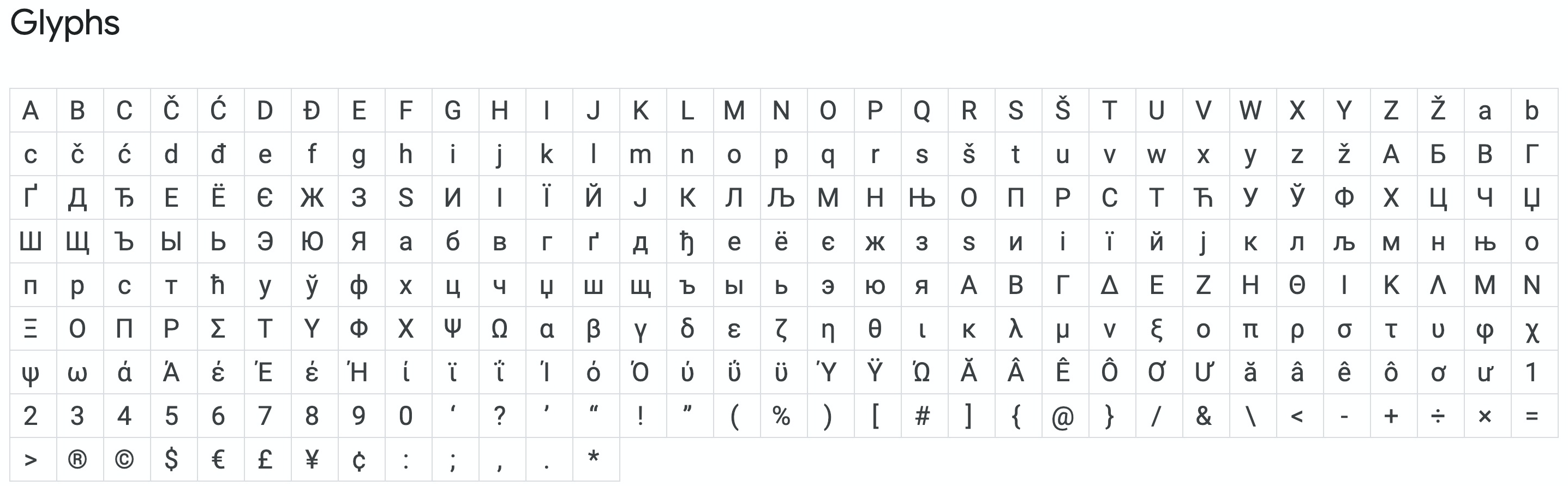
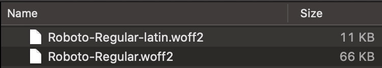
Many fonts will have glyphs (glyphs are individual characters like a or &) from multiple alphabets. If your website is only delivered in the latin alphabet (a - Z) and does not use ligatures (like é) then these glyphs represent wasted bytes in your font file. Roboto, the most popular Google font, has 277 glyphs.
Removing non-latin characters from this font results in a woff2 file that is one sixth the size!
If you use Google fonts, you can specify which subsets you require in the CSS request. If you host your own fonts (which I would always recommend, where possible) you will need to check with the font provider if they have subset versions, or where your license permits you can create subsets yourself.
To create subsets you will ideally start with the ttf file and work out what glyphs you need to keep. Filament Group have created glyphhanger to take out the hard work here, read their blog post to see how easy it is to create a unique subset font just for your pages. Note that missing glyphs will be rendered in the fallback system font, so they won't just disappear!
It is possible to create multiple subset variations of your fonts if your website supports multiple languages. In this case, use the unicode-range declaration in your @font-face rule to let the browser know which characters are in which font file. Read more about this on MDN or take a look at a response from Google Fonts for inspiration.
Use modern formats
There are a set of different formats available to serve web fonts: ttf, otf, eot, woff and woff2. ttf and otf are the 'raw' font files, and probably shouldn't be sent to a browser. eot supports subsetting and is compressed using LZ compression, whereas woff uses gzip compression and woff2 uses brotli compression.
Font stacks will often have many or all of these formats available, but you really only need woff2. The newer format is around 30% smaller than woff and is supported in all modern browsers. Supporting only woff2 will make it more simple to apply some of the other optimisations recommended, such as subsetting.
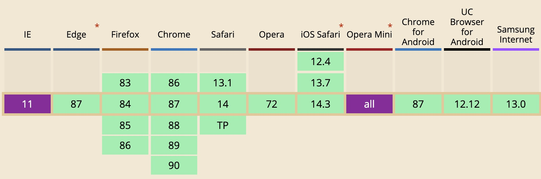
woff2 is supported on all the browsers you care about. sourceDeliver your fonts fast
It may seem obvious, but we must make sure that the browser can download our font files as soon as possible! There are a few techniques we should follow to ensure this is always the case. Hosting fonts on your own domain (and ideally on a content delivery network (CDN)) will result in the best performance.
Host your own fonts
Font foundries such as Google Fonts are popular: the HTTP Archive shows that 80% of sites use web fonts, and 7.5% of all web fonts are served by Google. Using a third-party service can incur a performance penalty, though. The Google Fonts embed process uses either a CSS link or @import, with the CSS file returning a dynamic set of @font-face rules. The rules are distinct for the given font, user agent and any additional query parameters (like subsetting and font-display options).
Using a third-party service means that your fonts will be delayed. The best-case scenario is that you are requesting the font file directly from another hostname (e.g. fonts.gstatic.com) which incurs a connection cost - DNS lookup, TCP connection and TLS negotiation. The worst case is multiple hops, like loading a CSS file from fonts.googleapis.com which references files on fonts.gstatic.com, incurring two connection penalties. This cost may be outweighed by the benefit in some cases for Google Fonts though, as the fonts they deliver are well optimised and subset by alphabet automatically.
In general you should serve the fonts from your domain to avoid the cost of connecting to third-party domains, this will be especially important on high latency connections.
Cache your fonts
Fonts can be cached in two places: the client and the CDN. Caching on the client is important for mid-session navigations and should be done in such a way as to avoid revalidation requests. Revalidation requests (if-not-modified and if-modified-since) will block the browser from using the font file until it has verified that it has not changed on the server. Fonts rarely change, so we should implement a cache header as follows and update the filename if the font changes to break the cache:
cache-control: max-age=31536000,immutable
This tells browsers that they can keep the font for up to a year and that it does not need to be revalidated (immutable is supported in Firefox and Safari, Chrome should avoid revalidation requests automatically). Avoid adding ETags to these responses as they may force revalidation.
Check also that your Content Delivery Network configuration can store the font files in cache, older configurations may not include the .woff2 extension resulting in origin hits and slowing down the response.
Use preload hints
Web browsers do not download fonts unnecessarily, they wait until the render tree has been constructed in order to know which fonts are required. This means that web fonts are only requested when the browser has downloaded and parsed the HTML and CSS, right before text is rendered. Note that inline CSS does not require a network request - meaning your fonts could be fetched earlier in the page load.
If we know that a web font is definitely going to be required to render text on a page, we can make a promise to the browser that it needs to be downloaded as soon as possible. This is a preload hint:
<link rel="preload" href="/my-font.woff2" crossorigin="anonymous" as="font" type="font/woff2">When the browser parses this line of HTML it will immediately dispatch a high priority request for the font file. Doing this means that the web font is much more likely to be available when the browser renders text.
preloaded requests will cannibalise bandwidth from other early requests, use with caution!
Preloaded requests are high-priority. In the waterfall section below you can see that five font files are downloaded, one blocks the page CSS (possibly because the <link rel="preload"> was above the <link rel="stylesheet">) and the others block the main JavaScript bundle for the page. Note that this page was served over HTTP/2 on Chrome, other browsers and protocols will vary!
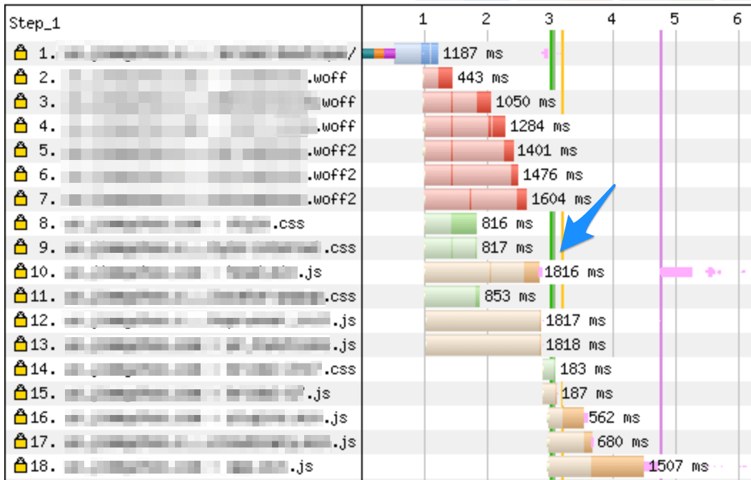
Ensure that your preload tags are below critical content in the head and limit to two or three font files to get the best benefit.
Reduce layout shift with f-mods
If font-display: optional is not possible for your design, we need to attempt to match the fallback font layout to the web font as closely as possible. Enter font-display modifiers (f-mods), also known as font-face descriptors.
F-mods are in a proposed update to the font-face descriptors specification which includes four new descriptors:
- ascent-override (%) - overrides the size allocated for ascenders
- descent-override (%) - overrides the line height allocated for descenders
- line-gap-override (%) - overrides the gap between lines
- advance-override (#) - sets an extra advance for each character, to help match line width and prevent word overflows
The first three all impact the height of a line: line box height = ascent + descent + line gap. Baseline position = line box top + line gap / 2 + ascent. For example, if we have ascent-override: 80%; descent-override: 20%; line-gap-override: 0%, then each line box has height 1em (assuming 1em used font size), and the baseline is positioned at 0.8em below the line box top. The advance-override descriptor adds a fraction of the font-size as a gap before each character, for example font-size:16px; advance-override: 0.1; will add a 1.6px gap before each character.
The combination of these four descriptors allow us to override the layout of the fallback font to match the web font, by telling the browser how much space the characters will take up before the web font is downloaded. Read more in the proposal.
Implementing f-mods
The trick to implementing f-mods is to manually define your fallback system fonts with src: local(). This allows us to override the display of the fallback font to match the web font:
@font-face {
  font-family: custom-font;
  src: url("https://example.com/font.woff2");
}
@font-face {
  font-family: fallback-font;
  src: local(Arial); /* required! */
  advance-override: xx;
  ascent-override: xx;
  descent-override: xx;
  line-gap-override: xx;
}
body {
  font-family: custom-font, fallback-font;
}
Calculating the required values might seem complex, but the information we need is already in your web font file. First you'll need the TTF file for your font; if you use Google Fonts then you can check find the TTF in the GitHub repository. If you have licensed a font from a foundry then the TTF should have been supplied already.
Once you have the TTF head on over to FontDrop and upload the file. Open the Data tab and scroll to the hhea - Horizontal Header Table. There you should find four key values: ascender, descender , line-gap and advanceWidthMax.
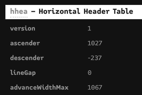
These values are exactly what we need to set the font-face modifiers! In this case the web font has unitsPerEm = 1000 and ascender = 1027, so it's best to set ascent-override: 102.7% in the fallback font face. I recommend experimenting with values until you find the right balance, using the playground below.
F-mods Playground
Use this codepen to load your custom and fallback fonts, then play with the overrides to get a perfect match! Note that this will be specific to the operating system you are using, it may be worth validating across multiple devices.
See the Pen font-face descriptor playground by Simon Hearne (@simonjhearne) on CodePen.
F-mods limitations
F-mods only really modify vertical spacing and positioning. This means that character- and letter-spacing still need to be dealt with otherwise you could have words breaking lines at different points, leading to a change in element heights and thus layout shifts. Unfortunately the letter-spacing and word-spacing properties are not available in the @font-face declaration so they must be declared on the body or an element. This means we may still have some work to do in order to prevent layout shift.
If the character and letter spacing needs to be modified for the web font, will need to apply CSS rules to all elements with the web font applied for when the fallback font is shown. This style must then be removed when the web font is loaded. This is possible using the font loading API, but the whole process feels racy and fragile. Changing layout-critical CSS with JavaScript doesn't sit right with me.
Browser support for font-face descriptors is... well it's only in Chrome, in v87+. There are, however, positive signals from Safari. No matter the browser support, font-face descriptors are a progressive enhancement so there is no reason not to implement them now.
Guaranteeing fonts load in time
It has been suggested that fonts can be embedded in CSS as Base64 strings, thus removing the need for additional font requests and ensuring that the font is available at the time of rendering text. I have seen this on production websites, and it does achieve these goals.
Embedding fonts as Base64 strings comes with a number of drawbacks, as such I would not recommend this approach:
- Font files are compressed binary objects, encoding as Base64 strings will inflate the size significantly. gzip or brotli compression of the CSS bundle will not totally make up for this inflation.
- The fonts will be sent to every browser, even if they can't use them (e.g. Opera Mini and IE11 for woff2, users of Dyslexia Friendly)
- Fonts rarely change, but CSS changes often - this will reduce cache effectiveness for fonts as every CSS change will invalidate the whole bundle
- Inflating CSS size will almost certainly delay page render
- Embedding fonts prevents you from effectively using subsets and unicode-range for different alphabets
In general, embedding fonts in CSS breaks the magic of web fonts: that browsers know what they need and will download it when they need it. There are two other options if you absolutely require the fonts to be available before the page renders:
- Hide the body until the font is ready, using
opacity: 0and the Font Loading API to show content once the font loads (with a sensible timeout) - Use
display:blockand match the fallback font as closely as possible to your web font
Option 1 would need a lot of testing to ensure that content is always shown eventually, I would avoid it entirely.
The future of font performance
It is clear that font performance is not yet a solved problem. Thankfully, there a works afoot to improve this in the W3C Web Fonts Working Group. One of the proposals is progressive font enrichment, this is an incremental font loading concept which allows browsers to request exactly the characters they need to render text, potentially drastically reducing initial font file size and thus improving render speed.
Google has a demo of this incremental transfer concept, and Jason Pamental has written up the concept in much more detail than I could here.
Whilst the incremental font loading concept is interesting, the main use case will be for very large font sets for non-latin languages. There are potential issues of cache dilution to resolve and the overall size of fonts delivered could exceed the optimal subset font file. Watch this space for more developments!
In conclusion
Layout shifts are bad for user experience and tricky to resolve. Rendering text without layout shifts is much more complex than it should be! You can avoid layout shifts entirely if you can apply font-display: optional to your web fonts, otherwise it's a case of racing the browser - trying to get your fonts to the browser before it starts to render text.
Racing the browser is possible by optimising your font files:
- Use
woff2to minimise file size - Serve fonts from your own domain
- Preload critical fonts
- Subset the font to required characters
- Limit the number of weight variations used
- Explore variable fonts
- Experiment with system fonts
- Use f-mods to reduce the impact of font swaps
As always, test all changes with real users and only keep them if you see a positive change. On this site I have set the body text to font-display: optional but my heading font and the italic variant of the body font to font-display: swap. Swapping in the heading font and italic variant do not cause a layout shift in most cases (except multi-line headings) so this is a good compromise between design and performance, in my opinion.