Optimistic UI Patterns for Improved Perceived Performance
Introduction
Web performance is often seen as a technical discipline, arranging bits and bytes to shave off milliseconds of load time, applying best practices, using the latest protocols and formats. Users don't perceive milliseconds though, they don't (typically) care if you use HTTP/1.1 vs HTTP/2 or JPEG vs WebP. Web performance optimisation is really optimising the speed of user experiences, Sergey Chernyshev even thinks we should rebrand web performance to UXSpeed!
If web performance isn't all about technology, it must be about user experience design: orchestrating the web experience to create user delight. There are a number of techniques which aim to improve the speed of UX including low quality image placeholders, skeleton UI and optimistic UI patterns.
I love optimistic UI patterns because they can often have a great return on investment: a big impact on user experience for a relatively small engineering effort. These UI patterns assume the best but prepare for the worst, optimising the UI feedback loop to give a better user experience.
Feedback First!
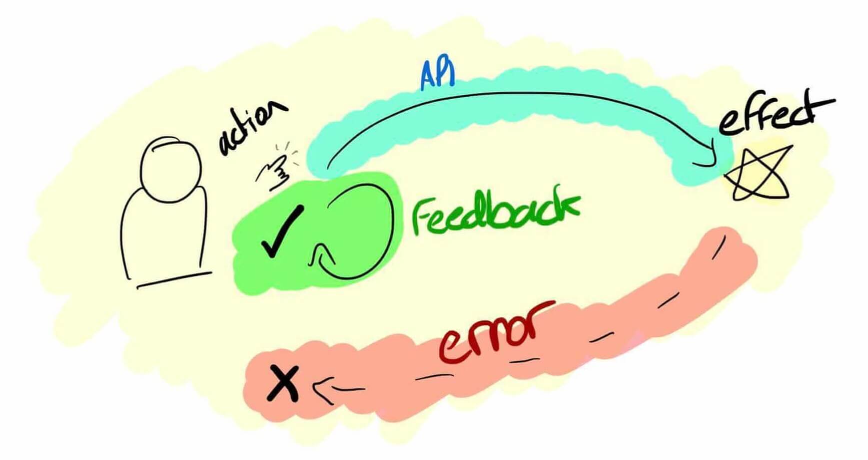
Optimistic UI patterns have a simple goal: to give the feeling of a robust and instant UI. As humans we start to notice delays around 100ms and frustration increases with the delay, remember the 300ms mobile tap delay? A round-trip to a server might take 50ms in the best case scenario, but a large number of requests will exceed 100ms due to network latency and varying server response times. Waiting for a network request means that your UI is bound by variables outside of your control, like your users' network connectivity and device performance.
Optimistic UI patterns decouple user feedback from the network.
Optimistic UI patterns decouple user feedback from the network, giving you more control of the speed of the user experience. There are some great opportunities to improve the perceived performance of most pages by applying these patterns to key user interaction points, let's look at some examples!
Optimistic Cart UI
Allbirds is a New Zealand-American company which designs and sells footwear. The Allbirds website feels very fast to navigate, they use a number of optimistic techniques to achieve this sensation even on poor connections. One of my favourite uses of optimistic UI is the Allbirds mini-cart. Anyone who has worked on a retail site will tell you that cart calls are expensive - they cannot be cached and typically require multiple database queries, this means that adding to cart is often a slow user experience. Allbirds have made efforts to resolve this delay by optimistically sliding in the mini cart immediately after a product is added, even when the API call has not yet hit the server. This does two things: it gives instant feedback to the user that their interaction has been registered, plus the slight animation to slide in the mini-cart buys some active time from the user to make the process feel even faster.
This subtle animation only takes half a second, but it buys enough time for the API call to be dispatched to the server and perhaps even for the response to be delivered. This combination of effects culminates in an extremely fast experience, prioritising user feedback in the UI.
This principle can be used any time an action triggers a server-bound UI change, such as creating an account, entering delivery details or submitting information for an insurance quote.
Optimistic Atomic Actions
You may have noticed that Twitter's UI feels remarkably fluid. One of the features which contributes to this experience is the favourite button.
Note that the animation starts as soon as you click, giving an immediate feedback response. This happens separately and in parallel to the actual API call to log the action. Further to the instant animation, the API call is resilient to network failures. If the API call fails it is added to a queue to be retried later. Only if the API call fails multiple times is the action "undone" in the UI - the heart icon simply fades back to the unchecked state.
This principle can be applied to any atomic action like starring a product, liking a message or saving an article for later.
Contextual Buttons
Active states have become less popular as skeuomorphism has lost favour in UI design. Active states give users immediate feedback from their action, like a shadow to indicate a depressed button. You can do more than just add a shadow, though. In this example we give immediate physical feedback, like a real button might behave, then provide further feedback related to the user's action right in their point of focus. The proximity of feedback to the user's focus is key here:
click me 👇
This principle can be applied anywhere a button press results in a server request but doesn't take the user away from the page, like add to cart, search or product configuration buttons.
Search Filters
Back to Allbirds for this one. Filtering products is often a painful user experience which can impact average order value and conversion rate. Allbirds have added an interstitial state to their filter UI which moves the content down and adds a spinner, making the experience feel more fluid once the results are delivered over the network.
This interstitial state does not need to serve any functional purpose - it just helps to give the user confidence that the website is working while the browser waits for server response of filtered results. This principle can be applied to any filtering UI which results in a server request.
Page Transitions
Some actions will always add a delay to the user interface, such as navigating to a new page in a traditional web application. This delay between clicking a link and the page context changing can take multiple seconds due to delays outside of your control. The browser's context will not switch to the next page until it can paint something to screen, often meaning multiple assets need to be downloaded first. Even if all blocking CSS & JavaScript is available in cache, the time taken to download and parse the HTML document and then retrieve the cached static assets and render the page can take over a second.
This inter-page delay can be jarring to the user experience, especially if page links do not have good active states. Thoughts of "did I click on that link?" and "is the site broken? I should click again." will start within fractions of a second with no UI feedback. A simple hack to improve the perceived performance in this scenario is to introduce a page transition: a simple spinner or blur effect to indicate that the navigation is occurring.
Jimmy Choo show a simple transition on the unload event of a page which fades away the screen and shows an animated logo. They also have a good active state on the button in this case, making it clear that the user has initiated a navigation. The whole process takes about a second, but feels quite seamless. This principle can be applied anywhere that you have a delayed page transition, especially if you know the target page will be slow such as loading search results or a shopping cart.
Pre-emptive Loading
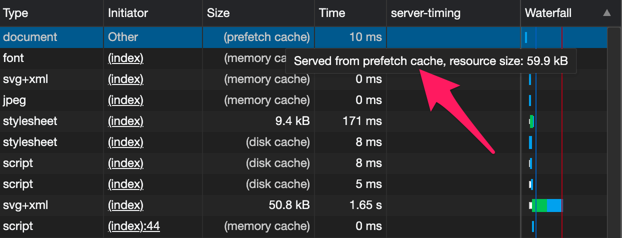
Users constantly give you hints as to what they are going to do next when they hover on and touch elements. By attaching to the mouseover and touchstart events on links we can respond to these hints and use them to buy us some time. On my homepage I inject a <link rel='prefetch'> into the document if you hover or touch one of the article cards, with the href attribute set to the target blog post. This tells the browser to start fetching the document so that the document should be already downloaded by the time the user's click or tap is complete. This should mean that the page can be served almost instantly from cache!
The open source project instant.page is a generalised application of this principle, although it is trivial to build it yourself in a few lines of JavaScript.
In Conclusion
Web performance is as much art as it is science. Consider how your UI behaves under less-than-ideal conditions and how you can implement optimistic UI patterns to decouple perceived performance from application performance.
The examples we have seen all apply some optimism - either that the request will succeed or that the user will complete an action. Optimism allows us to preempt an outcome and deliver it faster, resulting in happier users. Plus it's nice to raise tickets with optimistic in the title!
Sometimes small changes can have a big impact. Focus on changes which improve the feedback loop to user interactions and aim for under 100ms to deliver a UI response. Make a change, measure the impact on user experience and keep it if business outcomes improve!