Alternatives to Spinners on the Web
Animated spinners are one of the lingering legacies of the 1990's web.
In this post I will use an insurance quote service as an example, but these techniques can be applied anywhere that a spinner is currently used. First, though, let's look at the psychology of waiting.
Rules for waiting time
In The Psychology of Waiting Lines, David H. Maister describes the psychology of queueing. His research is based on real-world queues, but the psychology is applicable any time that people are forced to wait to complete a task - except that people have even less patience on the web, with an unlimited number of websites and applications to distract them from the current task.
I've extracted three key concepts which are most applicable to waits on the web:
- Unexplained waits feel longer than explained waits
- Unoccupied time feel longer than occupied time
- Anxiety makes waits feel longer
Explain the wait
Unexplained waits feel longer than explained waits
Spinners don't explain why a user is waiting, just that they have to wait. Giving the user an explanation of why they have to wait can be a simple step to reduce the perceived duration of the wait; a secondary benefit is that the time taken to read any explanation is active time - this can buy us a second or two of wait time!
For our insurance website, we can humanise the wait with an explanation:
We are generating your quote, evaluating the criteria specific to your situation and determining the best possible price and coverage. This might take up to a minute.
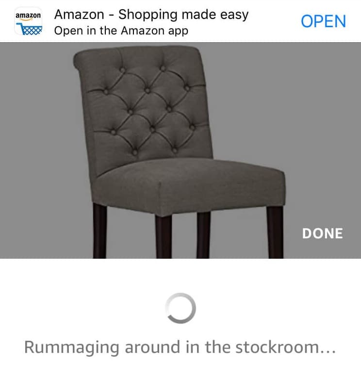
You may have seen this in action on travel websites or even retail sites. For example Amazon will add a message when calling APIs for stock levels of reseller products and comparison sites will often have text describing how many quotes have been retrieved.
Occupy time
Unoccupied time feels longer than occupied time
In the real world you might pull out your phone whilst waiting in a queue, or pick up a magazine in a waiting room. Users can easily do this on the web: switching tabs or checking in on a social media application. Our goal is to keep the user active on our application, so we should aim to occupy the user's time where they are waiting.
This technique has been used for decades in games: in 1998 Namco was granted a patent to add mini-games to the loading screen for large games. This was a reaction to the move from cartridge games to CD-ROM which took much longer to load into memory, leading to frustration.
Whilst users on the web might object to playing games on waiting screens, there are other techniques which might achieve the same goal. For our insurance quote, we could add a simple survey to the waiting screen:
How easy was this quote process? Answering will not interrupt your quote. 1 - very difficult, 10 - super easy.
It can be even more simple, such as some text body for the user to read. This can be marketed to the user based on the product or service they are waiting for:
Our insurance products are backed by 50 years of experience, we insure over 2 million people like you every year.
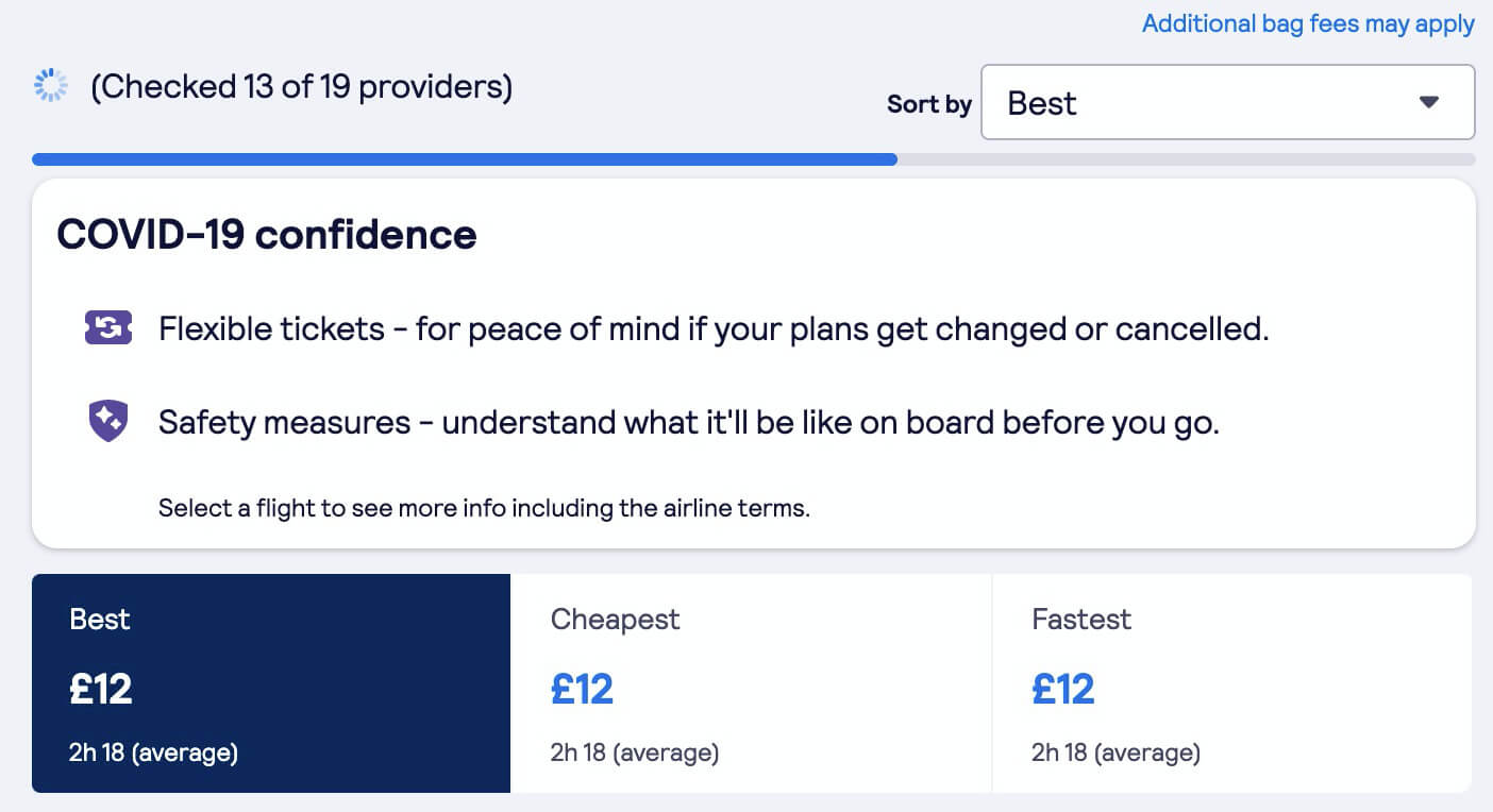
There may be other opportunities to keep the user engaged, such as showing interim results like SkyScanner or custom quotes like Slack.
Create certainty
Anxiety makes waits feel longer
Knowing that you have to wait is bad enough, but not knowing how long you need to wait makes it much more frustrating. Think back to the last time your flight or bus was delayed without an ETA. You cannot make plans without knowing when you will depart or arrive - do you have enough time to use the restrooms or get some lunch? Will you need to change a transfer?
Amusement parks often have estimated wait times in queues, this is done to reduce wait anxiety! It also serves a secondary benefit: the estimated wait times are almost always an over-estimate, so that as you progress through the queue you feel like you are winning back time. If you expected to queue for 45 minutes but got to the end in 30 minutes, you would feel good about the waiting time. Compare that to how it feels to have an unknown wait that ends up taking 30 minutes, like in a queue at a shop or government office.
Doing this on the web can be tricky, but I'm certain that somewhere in your business you have measurements of the duration of complex tasks. For example an insurance company knows that it takes on average 30s to generate a quote, with the 95th percentile task taking 60s (that means that 95% of quotes will be generated within a minute). This data can be used to create messaging on the web:
Please wait while we generate your quote, this should take thirty seconds
At the point that 30s has passed, update the message:
This is taking a little longer than normal but the quote should be generated in just a minute
Once the 60s mark has gone, it's time for an apologetic message:
We're sorry this is taking longer than usual, please bear with us as we generate your quote. If you'd like to speak to us on the phone, please call +1 555 1234
Alternatives to spinners
Consider the three concepts above: explanation, occupying time and certainty. Spinners don't really solve for any of these! Let's look at three alternatives.
1. Show progress indication
One of the frustrations of spinners is that they don't convey any progress, just a perpetual animation that might mean that something is happening in the background.
Users want to know that something is really happening, and that there is progress towards completion. It is tempting to replace a spinner with a progress bar - but this only works if you can show real progress. Fake progress bars might be worse than spinners, especially when they get stuck at 99% and cause user frustration!
It is best to complete longer tasks earlier if you can get stages of feedback to update your progress bar, users want to see feedback early but become less patient as they wait.
You can estimate the speed of the progress bar using historical data if you can't get realtime feedback from the application. In our insurance example we know that 95% of quotes are returned in a minute or less, so we can use that as our extent on the progress bar. A trick to make the progress feel a little faster is to use a non-linear progression: accelerate to make the initial few seconds feel faster, and decelerate at the end to buy a little more time. Research on non-linear progression shows that users prefer accelerating progress indicators, although this research did not include multi-phase progression (e.g. accelerating and decelerating).
All of these progress indicators have the same total duration, which one feels faster?
2. Remove the spinner
If your spinner is a placeholder for other content - like images or dynamic forms - you might be able to get away with simply removing it!
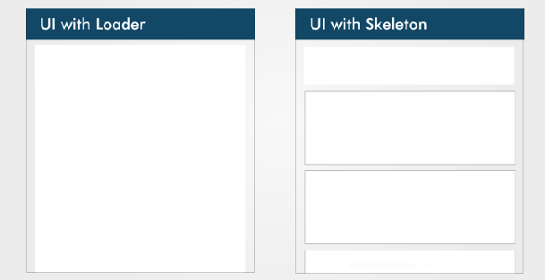
Spinners appearing and disappearing can be disorienting, so if the wait time is under a second or two it is worth considering removing the spinner. Good alternatives to spinners are placeholder elements such as low quality image placeholders or skeleton UI.

3. Keep a spinner, but make it nice
If there really is no way to determine how long a wait will be, we might need to keep a spinner. In this case, the spinner should be branded and accompanied by some explanatory text.
Animated gif files are bulky and have a limited colour palette - SVGs and CSS animations are the way forward. These will render nearly instantly (assuming inline SVG and CSS) and will look great on retina displays. Take a look at loading.io for some inspiration, or read Cassie Evans' blog post on how they created their animated logo for some advanced techniques!
See the Pen Cassie! by Cassie Evans (@cassie-codes) on CodePen.
There are some good examples of custom loaders out in the wild, such as the Transport for London travelling bus and Jimmy Choo's spinning logo which is shown on page transition.

In summary
Spinners are the most simple option when you have a long task of indeterminate duration, but they may cause user frustration. You should replace ambiguous spinners with better progress indication and add dynamic explanatory text. If you must use a spinner, make sure it uses more modern technologies like CSS and SVG, that it is branded to your site and that it is relevant to the task at hand.