Survivorship Bias in Web Performance
Introduction
Way back in 2010, an engineer at YouTube kicked off Project Feather: the goal was to reduce the weight of the popular video player page to improve performance. The project was a success: the page weight was reduced from 1,200kB to 98kB and the total number of requests was cut by 90%.
The analytics of Project Feather experiences did not reflect the improvements though: the aggregate page load time actually increased. Further investigation revealed that traffic from countries with poor connectivity had dramatically increased — users who previously could not even load the page were now able to watch videos. These new visitors had relatively slow experiences, bringing the aggregate values down.
There are similar stories from a wide range of websites:
- the bank who decided not to invest in mobile web because customers preferred desktop online banking to mobile (the mobile site was so slow it was barely usable)
- the retailer who had no iPad 1 traffic so stopped testing on iPad 1 (the website failed to load on iPad 1)
- the retailer who had very low Android traffic and assumed their target demographic were iPhone users (Android experiences were twice as slow as iPhone)
There is a term for this issue: Survivorship Bias. If you search for it term you'll likely see a variation of this image:

The story goes that statistician Abraham Wald used damage logs for aircraft returning from sorties in World War II to identify where reinforcing armour should be applied. The red dots show where bullet holes were found, so the logical assumption would be to reinforce those areas. Wald, however, surmised that the lack of red dots on areas of the aircraft show locations where hits would be critical and result in the aircraft not returning — so the reinforcements should be applied to those areas.
Our decisions are influenced by the data we have, but what about the data we don't have? In the military example above it is clear where the data is missing, but the web is slightly more complex. The users who have the worst experiences are likely to be phantom bounces: they don't appear in your analytics or intelligence tools because they don't hang around long enough for the app to load and analytics to fire.
Speed Bias
Google is experimenting with a new web performance metric: abandonment. Not to be confused with traditional abandonment metrics like cart abandonment, this is to measure how many users leave a site before it even loads. As part of this research, Nicolás Peña Moreno in the Chrome Speed Metrics team used Chrome data to measure the impact of performance on page abandonment rate — i.e. how many visitors leave a page before it loaded.
The metric used for the performance side of this equation was First Contentful Paint (FCP), so abandoners were potential visitors who left the site before anything useful was painted on the screen. It's worth noting at this point that it is very difficult for website owners to track this data themselves as it is unlikely that any analytics or tracking code has had a chance to run before FCP (and nor should it!).
I've taken the data that Nicolás shared and created a visualisation below to show the scale of the issue. Unfortunately no sample sizes were included in the results so we can't measure statistical significance at the higher FCP numbers, but the trends speak for themselves:
On Chrome Android, every second that FCP is delayed results in an additional 2.6 percentage points of abandonment. To clarify with an example: if your FCP was exactly 4s for all Chrome Android users, your analytics likely under-reports these users by 17.3%. So if your analytics shows one million users, there are another 210k users that abandoned before being logged (1,000,000 / ( 1 - 0.173 )). Reducing your FCP by one second would increase your reported visits by 2.9pts or 35,000 (( 1,000,000 / ( 1 - 0.173 ) ) * ( 1 - 0.144 )).
It is clear that poor performance will impact your traffic numbers, and means that thousands of potential visitors are leaving your site without a trace. It is also clear that mobile visitors are less tolerant of slow sites.
There is a secondary issue here: the impact on performance metrics.
It is fair to assume from this data that slower websites don't appear as slow as they are (as the slowest experiences will lead to abandonment) and, as we saw with the YouTube Feather example, making performance improvements may not reflect directly in your data. If we take the values from the chart above and apply them to a typical (log-normal) performance distribution we can predict the impact on reported metrics. A sample data set of 10,000 visits is created and the mobile abandonment statistics applied to see the difference in results, try adjusting the goal mean of the distribution and observe the changes in the table below.
| Metric | Actual Visits | Excluding Abandons | Difference | Relative Difference |
|---|---|---|---|---|
| Visits | ||||
| Median FCP | ||||
| 75% FCP | ||||
| 90% FCP | ||||
| 95% FCP |
Whilst this data is entirely hypothetical, I hope it helps bring to life the statistics on mobile abandonment shared earlier. Slow sites are more affected by this issue, and so are slow visitors — is your analytics showing a low level of traffic from Android devices because there really are a low number of visitors, or just a high abandonment rate? The difference at high percentiles is worth noting too, your 75th percentile FCP may be reported over a second faster than reality!
Actions to take
It is extremely difficult to measure the impact of early abandonment as a site owner. It is possible to compare analytics with logs, though, and determine the user agents or regions which have the highest disparity between intent to load a page (from server or CDN logs for documents) and successfully loading the page (analytics or RUM data). This strategy has some issues: some requests in your logs will be for crawlers which don't execute your analytics JavaScript and there will also be some disparity between user agents due to visitors using tracker blockers.
It is possible to beacon data early in a page load in order to better capture visitors who abandon before traditional analytics scripts fire. Nic Jansma has written up an analysis of strategies which shows that beacon capture (on a fast site) can be improved from 86.4% to 92.8% by listening to pagehide and visibilitychange events in addtion to onload. This still requires the JavaScript to execute before the visitor abandons and for the beacon to not be blocked by tracker blockers.
Whilst there are strategies to improve our data collection for abandoners, we will always lose some data. The best method to reduce abandonment and increase captured traffic is... improving performance! There are two reasons for this:
- faster page loads mean that analytics events fire earlier and are more likely to capture the visitor
- faster page loads are a better experience, so visitors are more likely to stay on the page
Both of these are positive outcomes!
Whilst the focus in web performance has recently been on the Core Web Vitals, I encourage you to analyse your First Contentful Paint with as much scrutiny as Largest Contentful Paint, Cumulative Layout Shift or First Input Delay. FCP was used by Nicolás in the abandonment study because it is such an important indicator of user experience.
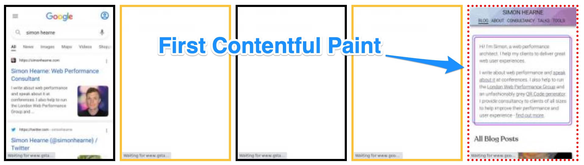
FCP marks the context switch from the previous page or a blank screen to showing something that the visitor actually expects to see, so in my analysis it is often the primary metric I focus on improving. If FCP is high, it means that visitors are more likely to think that the page is not working, they have time to reconsider what action they were taking and can easily hit the back button.
Note that FCP isn't a great cross-browser metric, so your mileage may vary when tracking it over time and across browsers and operating systems. That does not necessarily mean that it is a bad metric, it's just complex to implement consistently across the different browser engines.
The key points for optimising FCP are universal, though:
- reduce time to first byte (TTFB): use a CDN, cache HTML pages
- reduce blocking JS and CSS
- defer non-critical JS
- remove render blocking third-party tags
Expect to see the unexpected in your real user analytics when shipping performance improvements! Technically reducing FCP may in fact increase your reported FCP as more visitors on low-end devices and connections successfully load your pages. Expect to see traffic numbers change for different device types, and combine your performance metrics with business metrics to get a more holistic view of the success of each technical performance improvement.