Fast and Responsive Hero Videos for Great UX
Landing page hero videos are increasingly popular, especially in high fashion and luxury goods. Hero videos can have a detrimental effect on user experience though, delaying page load times and causing the page to jump around. In this post we will take an example homepage and see how we can optimise it to deliver fast, responsive videos for great UX.
Jump straight to the conclusion to see the results for each optimisation (in total we halve the video load time) and see the final working demo with code!
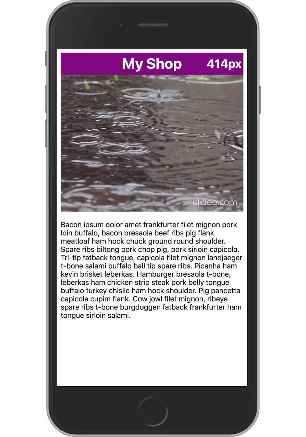
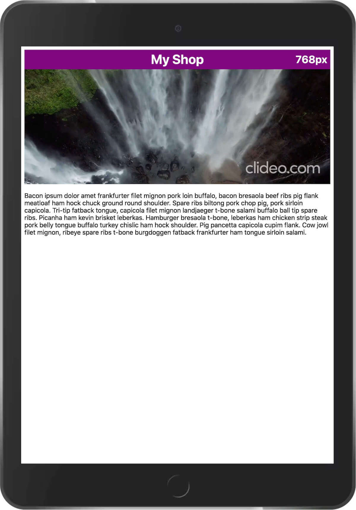
Consider this simple homepage with a hero video and content below the video. The video has been created in two aspect ratios: one for mobile / portrait viewports and another for desktop / landscape viewports. It is common to see this developed along the following lines:
<!-- ==== homepage.html ==== -->

<video
  class="full-width-video" id="hero-video"
  playsinline muted loop autoplay
  src="desktop.mp4"
  data-src-mobile="mobile.mp4"
  data-src-desktop="desktop.mp4">
    <div class="video-error">Uhoh, no video for you.</div>
</video>
/* ==== style.css ==== */
.full-width-video {
background-color: black;
width: 100%;
}/* ==== app.js ==== */
const DESKTOP_BREAKPOINT = 480;
window.addEventListener("load",function() {
let heroVideoEl = document.getElementByID("hero-video");
let heroVideoSrc = heroVideoEl.dataset.srcMobile
let viewportWidth = window.innerWidth;
if (viewportWidth >= DESKTOP_BREAKPOINT) {
heroVideoSrc = heroVideoEl.dataset.srcDesktop;
}
heroVideoEl.src = heroVideoSrc;
})Note that the <video> element no size attributes and has a src which will be replaced for mobile visitors. This causes two types of issue:
Performance
- The desktop video will likely always be requested, even for mobile visitors who will never see it. The browser should cancel the request when the
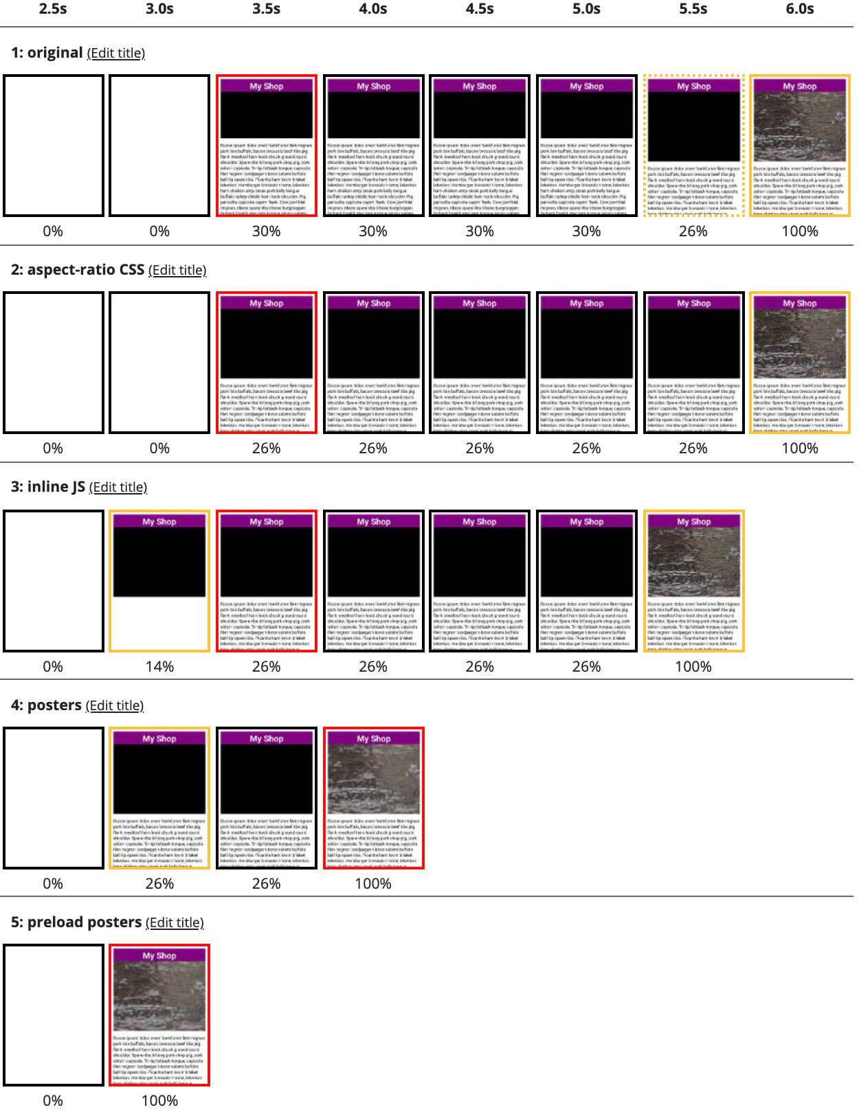
srcis replaced, at least. - The mobile video doesn't start downloading until after app.js has downloaded, parsed and executed - delaying the mobile experience. On a 3G connection we must wait six seconds to see the first frame of the video!

Layout
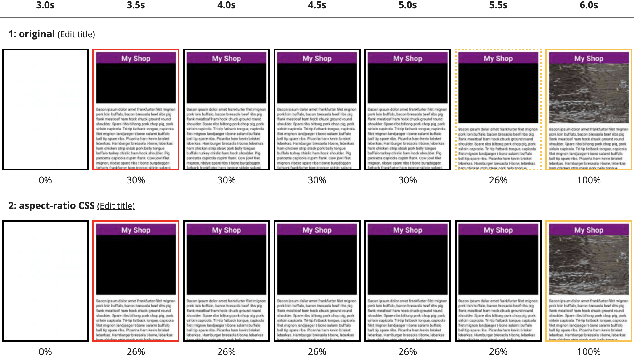
The browser cannot allocate the correct vertical space for the video until the first chunk is downloaded, causing an unpleasant layout shift at 5.5s in the filmstrip above.
The following four sections will take us from this six second experience to under three seconds, and with no layout shifts!
Optimisation 1: Preventing the Layout Shift
The layout shift above is caused by the lack of size information on the video element. In this case there are two different video aspect ratios - wide for desktop and narrow for mobile - so we cannot simply add width and height attributes to the <video> element.
aspect-ratio to the rescue!
aspect-ratio in CSS has only recently gained widespread browser support, but it is now safe to use across all evergreen browsers and Safari! This makes it simple to resolve the layout shift with just a few lines of CSS:
/* ==== style.css ==== */

/* default to mobile */
.full-width-video {
  width: 100%;
  background-color: black;
  aspect-ratio: 1280 / 960; /* width and height of the mobile video */
}
/* override for desktop */
@media only screen and (min-width: 480px) {
  .full-width-video {
    aspect-ratio: 1280 / 720;
  }
}
The result is that the browser knows how much space to allocate for the video, for both aspect-ratios, as soon as it is able to render the first frame. No more layout shift!
We haven't yet made the video load faster, though...
Optimisation 2: Better source selection
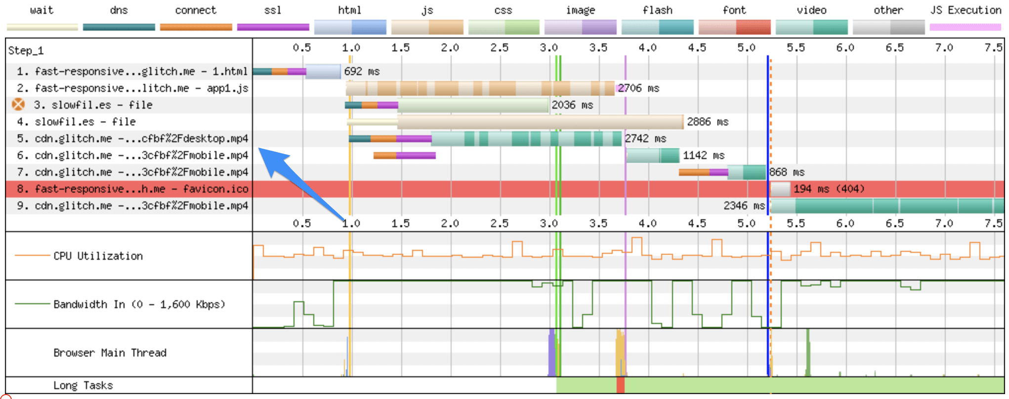
We're currently over-downloading on mobile by requesting the desktop video, then switching it out when our application JavaScript runs. Note that the desktop video continues to download until after app1.js has completely loaded at 3.6s.
Ideally, we would use native browser support to select the desktop or mobile video to avoid using JavaScript and remove the redundant request on mobile. Unfortunately this is not as easy as it should be. Intuitively we would use the familiar media query to determine which video version to load:
<video>
  <source src="desktop.mp4" type="video/mp4" media="all and (min-width:480px)">
  <source src="mobile.mp4"  type="video/mp4" media="all and (max-width:479px)">
</video>
Whilst this was once possible, it has now been removed from the spec and no browsers support it (except WebKit). So for now, we must use JavaScript. But we can still improve on the initial implementation!
The initial implementation had application code to set the video source that ran late in the page, well after the first paint. Moving the logic to be adjacent to the video will ensure that the code runs immediately after the video element is parsed by the browser, bringing the video render earlier.
First, we should remove the potentially wasteful desktop src value, then move the source selection logic out of app.js and into the HTML. I'm not generally a fan of inline scripts, but this is exactly the type of scenario where it makes sense. We can wrap this logic in a function and call it on resize to ensure that the correct video is always rendered. You will also want to add a <noscript> container with a fallback video at this point.
November 4, 2021: Updated based on Anthony Ricaud's feedback, thanks Anthony!
<!-- ==== homepage.html ==== -->

<video
  class="full-width-video" id="hero-video"
  playsinline muted loop autoplay
  data-src-mobile="mobile.mp4"
  data-src-desktop="desktop.mp4">
    <div class="video-error">Uhoh, no video for you.</div>
</video>
<script>
    const WIDE_VIEWPORT = 480;

    function resizeVideo(wideViewport) {
      let videoEl = document.getElementById("hero-video");
      let src = videoEl.dataset.mobileSrc;
      if (wideViewport.matches) {
        src = videoEl.dataset.desktopSrc;
      }
      if (videoEl.src !== src) {
        videoEl.src = src
      }
    }
    const wideViewport = window.matchMedia(`(min-width: ${WIDE_VIEWPORT}px)`)
    wideViewport.addListener(resizeVideo)
    resizeVideo(wideViewport)
</script>
The result is a slightly faster render, both of the page and the first frame of the video.

Removing the redundant download of the desktop video also saves some transmitted bytes, 350kB in this test.
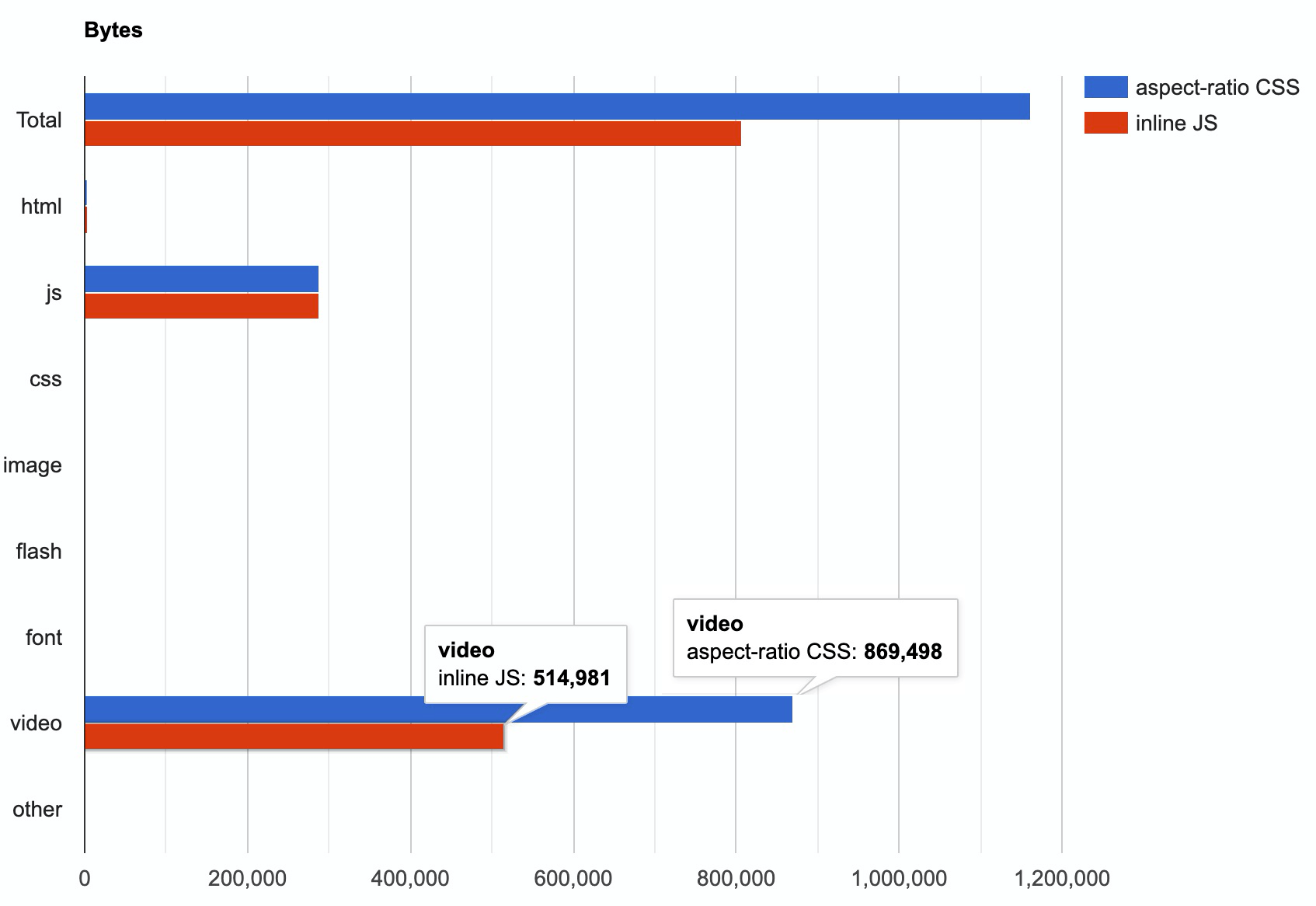
We are seeing some improvement, but 5.5s is still slow!
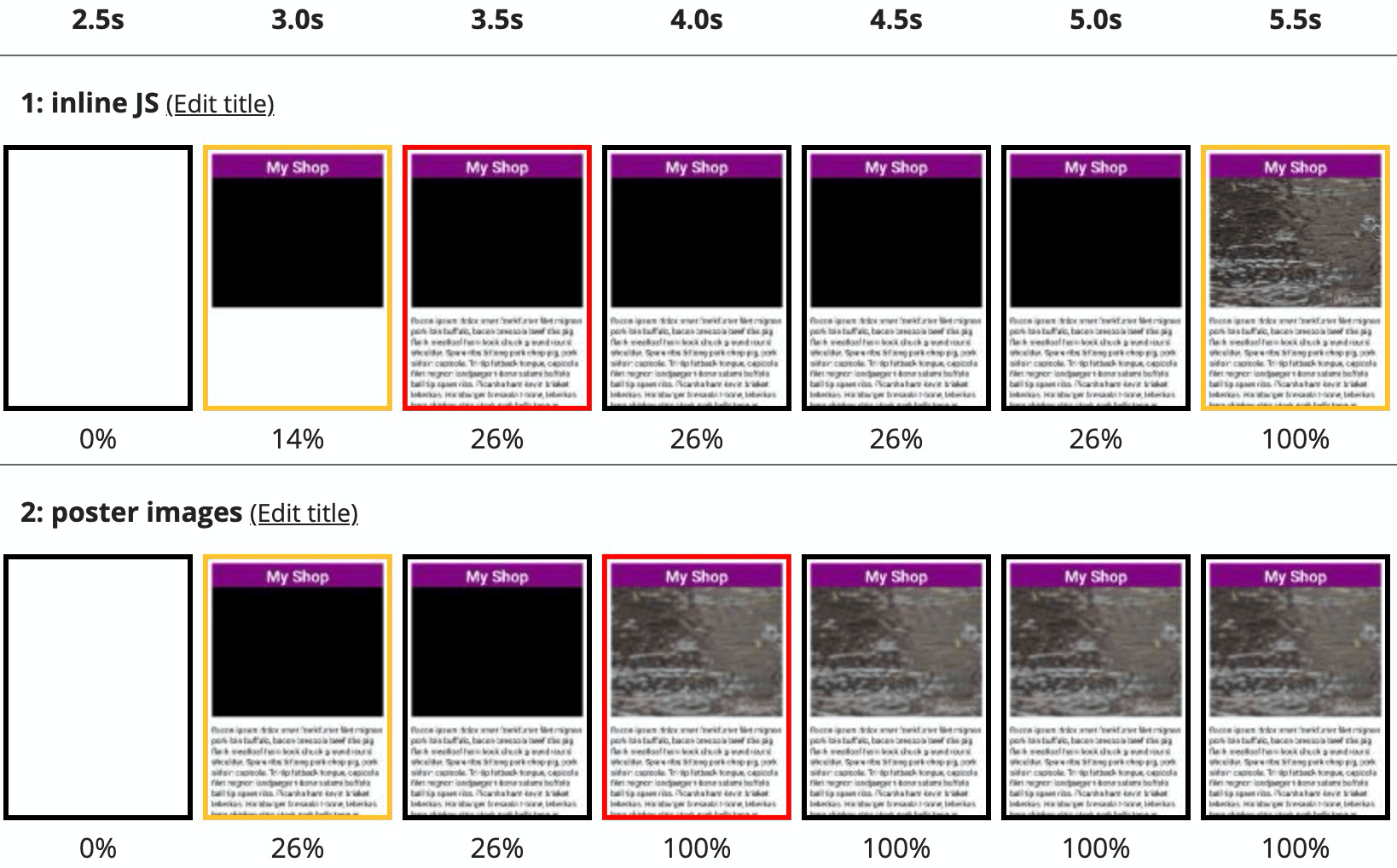
Optimisation 3: Poster Images
The HTML5 <video> element supports the poster attribute, this lets us define an image to use as a placeholder until the browser has downloaded enough of the video to start playing it. This is a more elegant solution than attempting to preload the entire video file, preserving early bandwidth for more important assets such as CSS and JavaScript.
Placeholder images can be heavily optimised as they are only shown for a short period of time. Use a gaussian blur and a high image compression level to get the image size to around 10kB for each video.
We'll add our optimised placeholder images using the same dataset logic that we have used for the video files:
<!-- ==== homepage.html ==== -->

<video
  class="full-width-video" id="hero-video"
  playsinline muted loop autoplay
  data-src-mobile="mobile.mp4"
  data-src-desktop="desktop.mp4"
  data-poster-mobile="mobile.jpg"
  data-poster-desktop="desktop.jpg">
    <div class="video-error">Uhoh, no video for you.</div>
</video>
<script>
    const WIDE_VIEWPORT = 480;

    function resizeVideo(wideViewport) {
      let videoEl = document.getElementById("hero-video");
      let src = videoEl.dataset.mobileSrc;
      let poster = videoEl.dataset.mobilePoster;
      let widthDisplay = 'MOBILE';
      if (wideViewport.matches) {
        src = videoEl.dataset.desktopSrc;
        poster = videoEl.dataset.desktopPoster;
        widthDisplay = 'DESKTOP';
      }
      if (videoEl.src !== src) {
        videoEl.src = src;
        videoEl.poster = poster;
      }
    }
    const wideViewport = window.matchMedia(`(min-width: ${WIDE_VIEWPORT}px)`);
    wideViewport.addListener(resizeVideo);
    resizeVideo(wideViewport);
</script>
The result of this is the biggest improvement we've seen so far - almost two whole seconds faster! This is especially important for low bandwidth users who may not see the video play for another ten seconds after the poster image is shown.
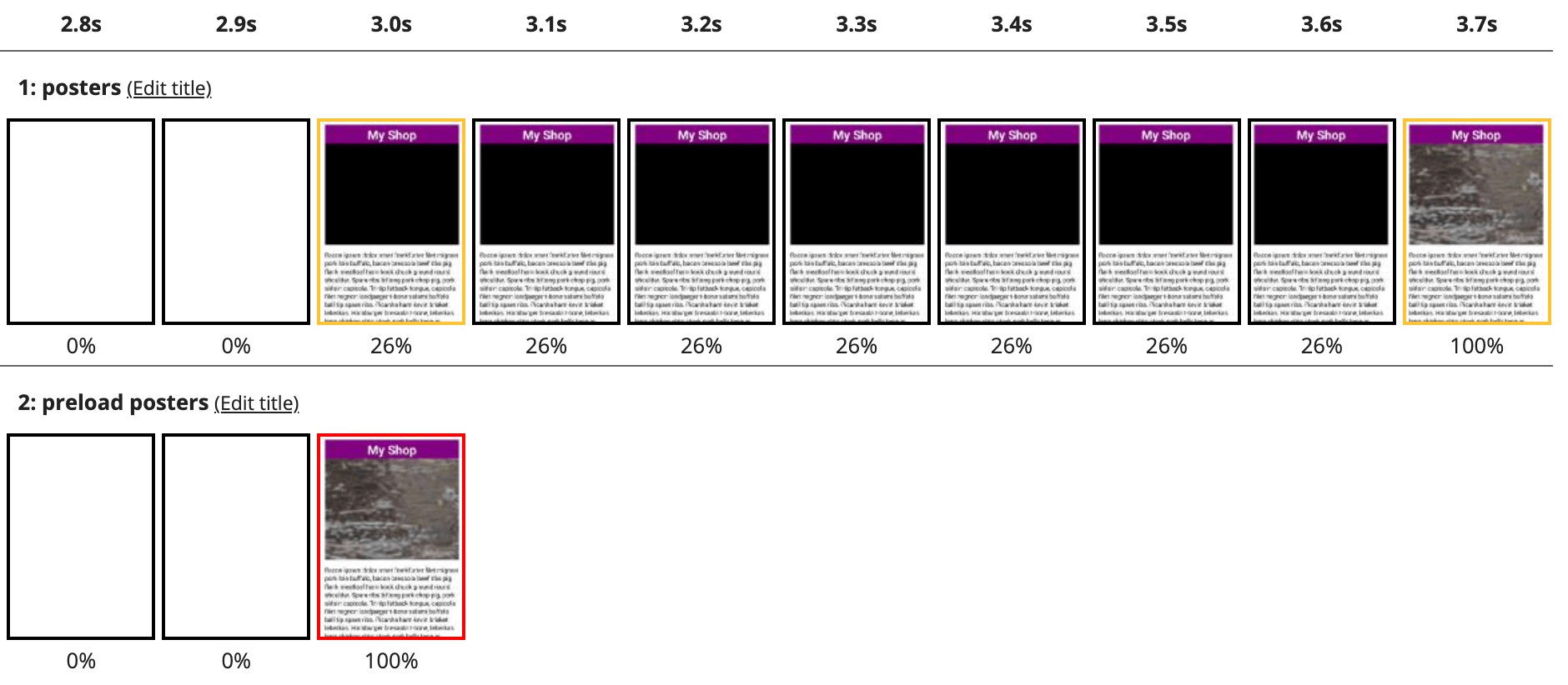
Optimisation 4: Preload the Poster Image
If you look carefully at the waterfall chart of the last test, you'll notice that the poster image is requested quite late - after the blocking script has downloaded and executed.

We can help the browser here by using preload hints, directives which instruct the browser to download files that it hasn't yet discovered:
<!-- ==== homepage.html ==== -->
  <!-- preloads should be at the bottom of the head -->
  <link rel="preload" href="desktop_poster.jpg" as="image" media="all and (min-width:480px)">
  <link rel="preload" href="mobile__poster.jpg"  as="image" media="all and (max-width:479px)">
</head>
These allow the browser to request the poster images early, and do support media queries so that we can fetch the correct image! The result is a slightly faster render of the poster image:
Another alternative that I have seen used is to Base64 encode the poster image and insert it directly into the attribute. I am not a fan of this method: it bloats the HTML document and causes the browser to download unnecessary content (at least one of the poster images is not required). I would not recommend this unless the encoded images are under 1kB, for example a simple play icon on a plain background.
It may be possible to further improve performance, specifically by deferring the application JavaScript bundle and further optimising the video files. For now, though, we should be happy with a 50% improvement in render performance!
Optimisation 5: Don't request video on low-bandwidth connections
Another consideration is for users who are on very poor connections, they probably would prefer to not have the video load and instead just the poster image.
We can extend our example to use navigator.connection.downlink to simply toggle the video src based on the connection speed.
  const MIN_DOWNLINK = 1; // Slow 3G ~~ 0.4, Fast 3G ~~ 1.4
  /* ... */
  let downlink = MIN_DOWNLINK;
  try {
    downlink = navigator.connection.downlink;
  } catch (e) {
    console.log(`Unable to determine downlink`)
  }
  if (videoEl.src !== src) {
    // only override values if they differ
    if (downlink >= MIN_DOWNLINK) {
      videoEl.src = src;
      widthDisplay += " - FAST";
      console.log(`Detected bandwidth (${downlink}Mbps) greater than threshold (${MIN_DOWNLINK}Mbps) - showing video`);
    } else {
      widthDisplay += " - SLOW";
      console.log(`Detected bandwidth (${downlink}Mbps) less than threshold (${MIN_DOWNLINK}Mbps) - not showing video`);
    }
    videoEl.poster = poster;
  }
You could also add a play button in this context, so users could opt-in to the video if they would like to see it.
Conclusion
We have applied four simple optimisations to a landing page hero video, removing a layout shift and improving the render time for the video from six seconds to three on a 3G connection. Videos don't have to slow down your site, as long as we pay attention to the details.
There are five key steps to ensuring your responsive hero videos render quickly:
- Set the video
srcas soon as possible - Use CSS to allocate the correct space for the video
- Use the
posterattribute for a fast rendering first frame - Use responsive preloads to optimise poster image delivery
- Optimize your video assets
We didn't cover it in this post, but it is critical that your video assets are optimised! Some simple tricks are to remove the audio track from muted videos, scale the video to the size it will be rendered and use the optimal format for the vistor's browser. Most of these are relatively simple to do, but for responsive videos it can be difficult to determine the optimal widths and formats. Here I would recommend using a video hosting & optimisation service which can automate these tasks:
Each of these (and a number of other services) can automatically serve the best format and width for each visitor, dramatically reducing file size and improving render performance.
To get started with your hero video, you can view the full working demo below or directly on CodePen. This code should be enhanced with error handling and support for browsers with JavaScript disabled: use a <noscript> element to contain a fallback video behaviour - perhaps just showing the poster image.
See the Pen fast-responsive-video by Simon Hearne (@simonhearne) on CodePen.